
Gamkin Logo Animation: Making Of
Note: This post was made back in 2017. However, back then I was told to remove the posts due to copyright reasons. Since the company has been defunct for several years, I decided to re-publish this blog post.I was tasked at Gamkin to remake the company's website, and shortly after sketching out the layout for the page, I decided I wanted to amplify the company's message and logotype with a short intro animation. In this post, I'll walk through the creative thought process and the steps I took to make the following animation and its variations, from start to finish. If you have a short attention span like me you can also just scroll through the post and look at all of the GIFs and videos.
Preface - Previous Works
Before starting I want to mention that I have very little experience with actually creating these things, which is part of why I wanted to show this process.
I've self-taught myself in Premiere Pro but have only recently started using After Effects. Here are three intro animations that I've made for my private Youtube channel:


Now the first one is simply straight up ripped from a After Effects template where I just switched out the text (which as I recall was super confusing for 14 year old me). I made the second one when I was 16 in Sony Vegas, which is obvious for me now that it has a lot of limitations as I could basically only play around with Position, Rotation, Scale and Opacity of things. The last one I made last year in a AirBnB room in about 1 hour with Premiere Pro. While perhaps poor in quality it also shows much you can push the envelope by using Scale and Speed Curves (shifting the speed of which things moves and changes).
After this I have started using After Effects more, and it's probably something I can't turn my back on now when I've seen what it's capable of doing with very little time. So if you're only working with Premiere Pro, I really recommend you to test After Effects out.
One thing to note with these intros are their length. Both the first and the second are about 10 seconds while the third one is 7, but with the last one I actually shorted it down to 1 second as can be seen in my video '🕹️ Playing【MUSECA】- Capitalism Cannon'. While there might not be a correct length for all setups, I feel like when it comes to shorter videos (under 10 minutes) then the title should be as short as possible, around 3 seconds max. Longer ones could be used but if so, I feel like it needs more of a reason than 'That's how I like it', since a lot of people click out of videos very early on. That's why I think the first two are annoyingly long compared to my latest one.
Getting Started - Gathering the Pieces
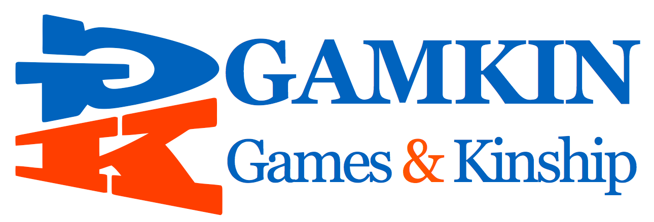
The old version of the GAMKIN logotype
When I began had the logotype and the instruction of making the logo feel like the old Japanese console startup animations. It also went without saying that the animation should fit with the company's color profile, slogan and general theme.
Color Profile: Orange, Blue and White
Company Name: GAMKIN, INC (GAMKIN is a combination of the words 'Games' and 'Kinship')
Slogan: Talk Together, Create Together, Play Together, Learn Together.
Theme: Minimalistic, Clean, Casual
All right from this information alone you can tell a lot of things. It's doesn't need any fancy 3D CGI and it doesn't have to look like a cut-scene, it just have to be clean and simple, but still adding the extra flavor of somehow combining the joy of games together with the kinship's which they bring. Great!
Research - Looking at Old and New
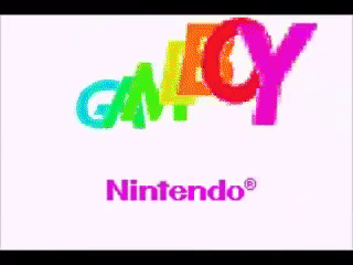
A lot of the employees are Japanese and above 30 or 40 years old so it's only natural that a lot, if not everyone at the company has a lot of rosy memories of the old school startup screens. For me the one I spent most time with was the Playstation 1 Startup and the Gameboy/Gameboy Color Startup. But there is also logotypes specific for games such as the Tony Hawks Pro Skater 2 Intro or one of the latest Valve Intros which have been used in multiple games.
Since I'm not too familiar with older console startup screens I had to venture to that section of Youtube and watch some videos. There I found the gem Console Startup Screens 1985-2013 which contained a lot of good ones. I also saw the PSP Startup which had completely forgotten both how it sounded and looked like.


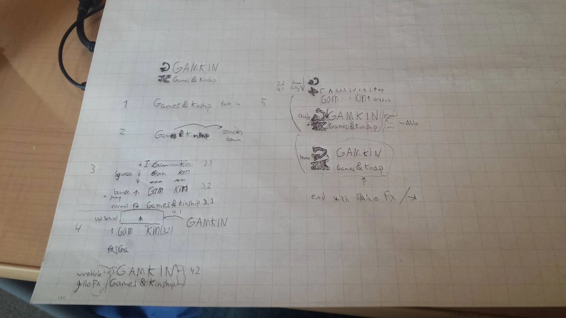
These are simple steps of ideas I had for how to reveal the different parts of the logo with motions. And yes, you probably can't read anything because I write with very tiny letters.
Sketching & Brainstorming
Usually when I make something visual I like to draw and write things on paper. Weather it's when planning a video, photo. logotype or level. It's not necessary and usually doesn't look anything like the final version, but it helps me to put vague thoughts into something that can actually be transferred into the digital world. It also helps me get started. before I drew this for example I had a hard time picturing how animating the logotype could look like.
First Try

As the logotype is rather stale being only made by letters and having no actual figures or mascots I wanted to breathe more life into it. The first step in this for me was to split up the logotype in different parts to reveal them separately, and then work my way around that.
To start of I wanted to keep that old school feeling, and what is more old school than pixelated junk? Well, using the Mosaic filter that's not a problem. So I thought I might start with that combined with a white wipe (barely noticible in the GIF though).
Since no one I've met has ever made the connection of GAMKIN being a fuse of GAMES and KINSHIP I wanted to highlight this further (sidenote: everyone keeps pronouncing it like 'Gamekin', like some sort of gamer alien). I wanted to do this in a sort of playful way so I wanted the 'Games & Kinship' part to stretch and bounce to reveal GAMKIN, with the GK falling from above next to them, making the rest of text jiggle from the impact.
Retrospect - First Try
You can see I stopped after the first motions because I thought it looked cheap overall. I also could tell that the amount of motions would pile up and make it feel too long. Although long logotypes were a trend back in the day, it's something that frustrated me so I wanted to keep the time down for this and moved on to another version. A good example of frustrating unskippable intro cut screens can be found in the Deus Ex Mankind Divided Startup (this one has glitched out colors, but you can see the length of the animations and startup)
Second Try
This time I wanted to make everything just shorter in general. When making the first try I also noticed that I didn't really have an interesting way to introduce the GK part of the logotype, so I started thinking about how I could make that part specifically to be more appealing. So I tried to make it more interesting by revealing it like a drop in water. I also added sound effects.
Retrospect - Second Try
First of all, yes that ding sound is annoying. While it kind of felt old school, it still felt cheap. I thought this is something that I could fix afterwards, but then I came to think of something. Having the 'GK' revealed last doesn't really add to anything.
When I first present the text 'GAMKIN: GAMES & KINSHIP' it's already telling everything there is to the logo. So when the 'GK' comes in at the end it's just kind of solidifying what's already known. Which made me want to scrap this one and reverse the order of the reveal.

Third and Final Try

One thing I have no shame in admitting is how much I use tutorials. They're essential to my creating process. I use them both for learning techniques but I also pick them a part and combine the pieces to create something new. I see a lot of people who straight up rip templates (which I also did when I was 14), but for someone who knows what to look for this can look incredibly stupid. When I see it I think that the creator either is thinking that I'm too stupid to notice, or that the creator is lazy and just bought or ripped some random template to create a fake illusion of professionalism.
Here's the thing though, if you can get away with it, that's good. Then you've respect me, the viewer, and you successfully created an illusion of professionalism. Like CGI is supposed to do. You also combine two things to create something new, that's awesome. If you can get away with it, please continue with it. But if you get caught, it will cost you. Either viewers, trust, or even money if it's really stupid obvious.

Moving I still felt a bit stuck on the reveal of the 'GK'. After looking at some tutorials though I came across the Liquid Motion Effect which I thought could work for the 'GK'. I realized pretty quickly I didn't want to involve other colors so I decided to do the effect twice which would then smash together. This in my opinion would symbolize the "Games & Kinship" getting together, also the circular motion of the line reminded me a bit about the Ying Yang harmony structures as well. After that, I decided to keep the rest simple and reveal it with a masked horizontal wipe with added motion blur.
For the sound, I was trying to look for something human sounding, like the Nintendo Switch sound (which basically just snaps with reverb). So I took a bottle pop sound and put reverb on it. Then when it lands I mixed a low-pitched Mario Jump sound with a droplet in water for the impact.
The last up was to sell the impact of the paint hitting the logo. I did this simply by adding a bit of scale bouncing (normal, down, up, normal), almost like a button, and adding a glow effect that fades away as it completes. Then considering the sound cue of the droplet I added expanding rings that fade out behind it like something hitting water.
Mastering - Sound / Effects
Now that I had this completed I showed the video to my friends and contacts who I trust to give me an honest critique. This is really important to me because in all things I make I tend to become a little blind to flaws when I look at something too long. Maybe there is a flaw that I've thought about, but I either forget about it, or I can't really tell if it's only something that I can see or a glaring mistake for others.
When doing this a lot of people were saying that the logo looked good in general (good thing I didn't show the first tries), but that it might've been a bit too fast as you can really tell some of the effects. My good friend Joachim Persson told me about the '12 Principles of Animation' and echoed something that another one also stated which was to exaggerate the scaling of the 'GK'. So I did that, not too much but a little more.
I also changed the sound a little. I lowered the loud jump so it would have a similar max as the bottle pop sound and added reverb to it so it didn't sound as flat. I also added a short wind effect after the pop sound to add more depth to it. It's barely noticeable, but for me who listened to it way too much I was really happy with the result.
Variations -Main, Shorter & Longer


In the beginning of the post I was talking about the lengths of my previous different intros which in seconds were 10, 10 and 7 (or 3). When thinking of these constrictions from the beginning I managed to get my main animation to be about 3-4 seconds. Now I wanted to challenge myself a bit and see if I could have a shorter and a longer version of it, just to give my company more choices but also make the branding seem more dynamic. For instance, the main one could be used for trailers, a longer one could be used for a website, company related videos and the short one could be for small updates.
For the short one I just cut out the last part of the 'GK' moving and revealing the text, while keeping the same sound effects.
With the longer one I didn't just wanted to add length, but add to the message somehow. What better way to do this than to incorporate the company slogan;
Talk Together, Create Together, Play Together, Learn Together.
仲間と好きなことを語って、作って、遊んで、学んで。
Since it's a bit long and repetitive I decided to shorten it down to;
Talk, Create, Play, Learn
語って、作って、遊んで、学んで。
But adding the text seemed a bit empty, so in true Japanese 'team spirit' marketing fashion, why not have a bunch of people read the slogan in sync with the animation?
Final Result
I'm still gathering the voice clips, so I will save the final results for the next post!
Since this is the first time writing about this kind of stuff, I'm unsure of how interesting how this was for anyone else.
If you have any opinions, or thoughts or challenges with creating title animations, please tell me! I'd love to talk!
Also feel free to leave a comment, subscribe to the blog or send me a message on the social links below!